Sensitivity and Specificity Visualiser
Drag a cut-off between two bell curves to see sensitivity and specificity trade off, and how prevalence sets PPV and NPV, with an ROC curve and AUC.
Visualiser
Drag the cut-off across the curves, or select the scene and use the arrow keys. Page Up and Page Down move it by 5.
Test results drawn as two normal curves: without the condition centred on 40 with a standard deviation of 10, and with it centred on 60 with a standard deviation of 10. The cut-off at 50 calls 84.1% of people with the condition positive and 15.9% of people without it positive. Of 1,000 people at a prevalence of 10%, 227 test positive, and 84 of them have the condition.
- Sensitivity TP / (TP + FN): the share of people with the condition who test positive. On the scene it is the area of the amber curve to the right of the cut-off at 50, Φ((μ₁ − c) / σ₁).
- 84.13 %
- Specificity TN / (TN + FP): the share of people without the condition who test negative. On the scene it is the area of the blue curve to the left of the cut-off, Φ((c − μ₀) / σ₀).
- 84.13 %
- False positive rate FP / (FP + TN) = 1 − specificity: the share of people without the condition who test positive anyway. It is the horizontal position of the marked point on the ROC curve.
- 15.87 %
- Positive predictive value TP / (TP + FP): the chance that a positive result is right. By Bayes’ theorem it is Se p / (Se p + (1 − Sp)(1 − p)), so it falls as the prevalence p falls.
- 37.08 %
- Negative predictive value TN / (TN + FN): the chance that a negative result is right, Sp (1 − p) / (Sp (1 − p) + (1 − Se) p). It falls as the prevalence rises.
- 97.95 %
- Positive likelihood ratio LR+ = Se / (1 − Sp): how many times more likely a positive result is in someone with the condition than in someone without. The odds of the condition after a positive result are the odds before it times this.
- 5.303
- Negative likelihood ratio LR− = (1 − Se) / Sp: the factor a negative result multiplies the odds of the condition by. The smaller it is, the more firmly a negative result rules the condition out.
- 0.1886
- Accuracy (TP + TN) / everyone = Se p + Sp (1 − p): the share of all results that are right. When the condition is rare it is mostly specificity, so a test that finds nobody can still score highly.
- 84.13 %
- Youden’s J Se + Sp − 1: 0 for a test no better than chance and 1 for a perfect one. It is the height of the marked point above the diagonal of the ROC plot.
- 0.6827
- Area under the ROC curve AUC = Φ((μ₁ − μ₀) / √(σ₀² + σ₁²)) for two normal curves: the chance that a random person with the condition scores higher than a random person without it. Neither the cut-off nor the prevalence changes it.
- 0.9214
| Test result | Has the condition | Does not have it | Total |
|---|---|---|---|
| Tests positive | 84 true positives | 143 false positives | 227 |
| Tests negative | 16 false negatives | 757 true negatives | 773 |
| Total | 100 | 900 | 1,000 |
Predictive values against prevalence
- Positive predictive value
- Negative predictive value
ROC curve
- ROC curve
- A test that tells nothing
Citing this tool
Last updated . Add the date you accessed it as well, which a citation of a page that can change asks for. If a specific result matters, cite the permalink from the tool’s share row instead of this page: it reproduces the exact parameters.
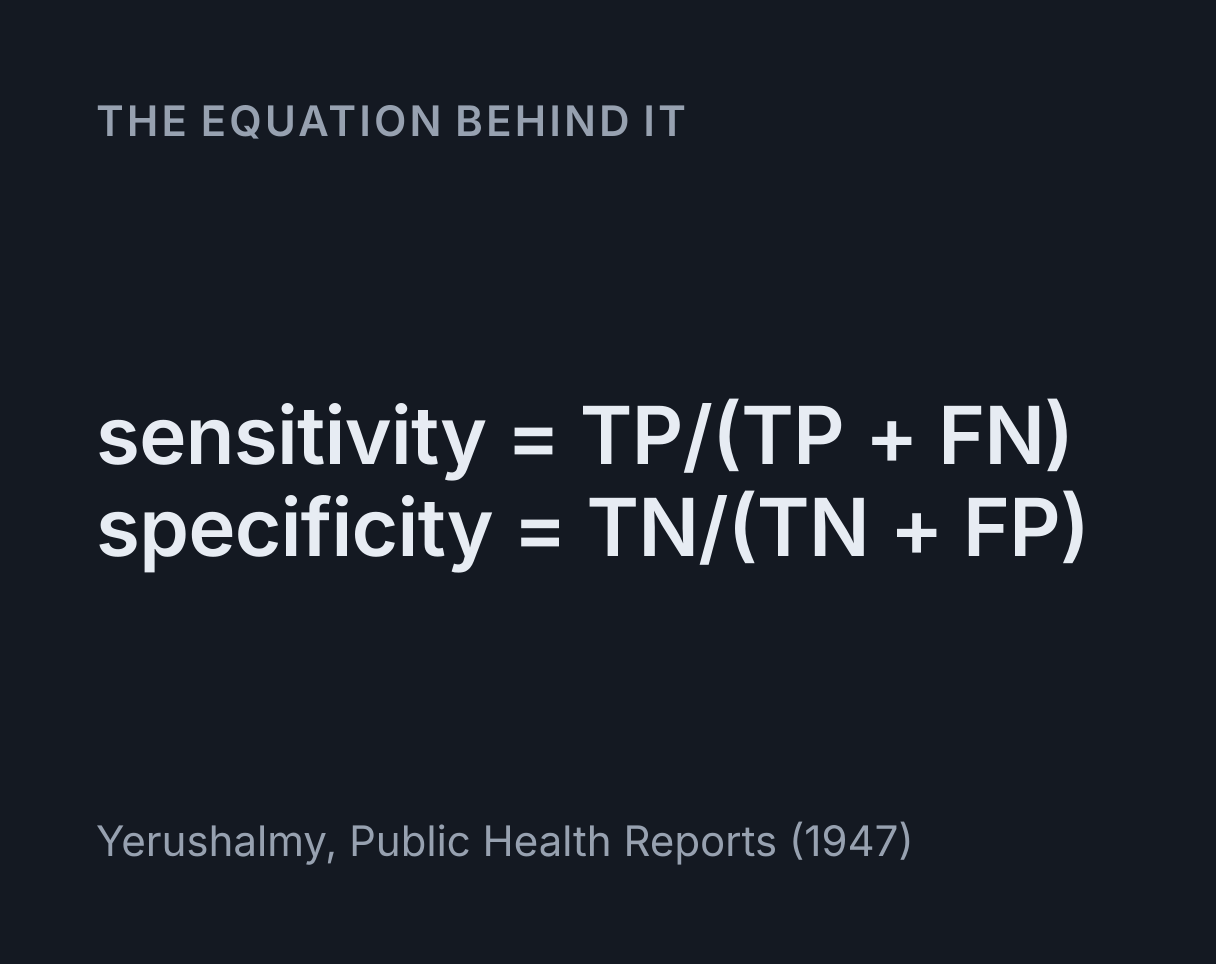
The equation
Yerushalmy, Public Health Reports (1947)
What are sensitivity and specificity?
Sensitivity and specificity measure how well a test separates people who have a condition from
people who do not. Sensitivity is the share of people with the condition who test positive, and
specificity is the share of people without it who test negative:
sensitivity = TP / (TP + FN) and specificity = TN / (TN + FP).
TP, FN, FP and TN are the cells of a 2 by 2 table: true positives and false negatives among people with the condition, and false positives and true negatives among people without it. Jacob Yerushalmy introduced both terms in 1947, in a paper in Public Health Reports on judging X-ray methods of diagnosis, and Douglas Altman and Martin Bland set out the same definitions in their BMJ Statistics Notes in 1994.
Most tests report a number and call it positive at or above a cut-off. The two groups’ results overlap, so wherever the cut-off goes, some people land on the wrong side of it. This visualiser draws each group’s results as a normal curve and the cut-off as a line you can move. Sensitivity is the area of the curve for people with the condition to the right of the line, and specificity the area of the other curve to its left. Neither depends on how common the condition is. The predictive values do.
Using the visualiser
Drag the cut-off along the curves, or select the scene and use the arrow keys, which move it by 0.5, or Page Up and Page Down, which move it by 5. The sliders set the cut-off, the prevalence, and each group’s mean and standard deviation on a scale from 0 to 100. For a real test the spreads would be estimated from people known to have the condition and people known not to, the calculation the Standard Deviation Calculator does for a column of measurements.
Amber is everyone with the condition and blue everyone without it; solid is a positive result and pale a negative one. So the four shaded areas under the curves are the four cells of the table, as shares of each group. The grid of squares is 1,000 people tested at the prevalence you set, filled row by row with the missed cases, then the cases found, then the false positives, then everyone else: the solid squares are everyone who tests positive, and the amber ones everyone with the condition. The table under the readouts gives the same counts, rounded to whole people.
Below the scene are the predictive values plotted against prevalence and the ROC curve, both at the current cut-off. The Rare condition, good test button sets the second example on this page, and Opening example puts the first one back. Scale the curves by prevalence draws each curve with an area in proportion to its group.
Worked example: a cut-off of 50 at a prevalence of 10 percent
The visualiser opens on results with a standard deviation of 10 in both groups, averaging 40 without the condition and 60 with it, a cut-off halfway at 50, and a prevalence of 10 percent.
-
Sensitivity: the cut-off is one standard deviation below the mean with the condition, so
Se = Φ((60 − 50)/10) = Φ(1) = 0.8413, where Φ is the standard normal distribution. -
Specificity: it is one standard deviation above the mean without, so
Sp = Φ((50 − 40)/10) = Φ(1) = 0.8413, and the false positive rate is1 − 0.8413 = 0.1587. -
Of 1,000 people, 100 have the condition and 900 do not. There are
100 × 0.8413 = 84.13true positives and900 × 0.1587 = 142.8false positives, which the table rounds to 84 and 143. -
Positive predictive value:
PPV = 84.13 / (84.13 + 142.8) = 0.371. The readout gives 37.08 percent, so fewer than 2 in 5 positive results are right. -
Negative predictive value: there are
900 × 0.8413 = 757.2true negatives and 15.87 false negatives, soNPV = 757.2 / (757.2 + 15.87) = 0.979, which the readout gives as 97.95 percent. -
Likelihood ratios:
LR+ = 0.8413 / 0.1587 = 5.30andLR− = 0.1587 / 0.8413 = 0.189. -
Accuracy:
0.1 × 0.8413 + 0.9 × 0.8413 = 0.8413, the same as the sensitivity and specificity because the two are equal here. -
Area under the ROC curve:
AUC = Φ((60 − 40)/√(10² + 10²)) = Φ(√2) = 0.9214.
So a test that is right about 84 percent of the time in each group gives positive results that are right only 37 percent of the time. Nothing is wrong with the test. There are nine times as many people without the condition, and 15.87 percent of a large group is more people than 84.13 percent of a small one.
Why a positive result can be unlikely to be right
Bayes’ theorem turns sensitivity and specificity, the probabilities of a result given the condition, into the predictive values, the probabilities of the condition given a result:
PPV = Se p / (Se p + (1 − Sp)(1 − p))
Here p is the prevalence, the chance before the test that a person has the condition. When p is small, the false positives in the second term swamp the true positives in the first, however good the test. Press Rare condition, good test: the means are now 40 and 80, four standard deviations apart, with the cut-off halfway at 60, so sensitivity and specificity are both Φ(2), 97.72 percent, and the AUC is 0.9977. The prevalence is 0.1 percent, 1 person in 1,000.
That person almost certainly tests positive, but so do 999 × 0.02275 = 22.7 people
without the condition, and the PPV is 4.123 percent: about 1 positive result in 24 is a true one.
The icon array shows a single solid amber square among 23 solid blue ones. Raise the prevalence to
1 percent and the same test’s PPV is 30.26 percent, and at 10 percent it is 82.68 percent. The
negative predictive value hardly moves. At 0.1 percent it is over 99.99 percent, because a
negative result was almost certain to be right before the test.
This is the base rate fallacy, and doctors are not immune to it. In 1978 Casscells, Schoenberger
and Graboys asked 60 doctors and medical students at Harvard teaching hospitals about a condition
with a prevalence of 1 in 1,000 and a test with a false positive rate of 5 percent. Only 11 gave
the right answer, about 2 percent if the test finds every case,
1 / (1 + 49.95) = 0.0196. The most common answer, from 27 of them, was 95 percent.
Scale the curves by prevalence shows it in the curves: at the opening settings the blue area
right of the cut-off, 0.9 × 0.1587 = 0.1428 of everyone tested, is larger than the
amber one, 0.1 × 0.8413 = 0.0841.
Prevalence is not fixed either: it rises and falls over an outbreak, as the SIR Epidemic Model Simulator shows, and the same test’s positive predictive value rises and falls with it.
Moving the cut-off
Drag the cut-off to the right and it calls fewer people positive: specificity rises and sensitivity falls. At 55, sensitivity is Φ(0.5), 69.15 percent, and specificity is Φ(1.5), 93.32 percent, and with fewer false positives the PPV at 10 percent prevalence climbs to 53.49 percent. No cut-off improves both rates, because both come from the same two curves; only curves that overlap less, with means further apart or narrower spreads, can.
The best cut-off depends on what a mistake costs. A screening test, where a missed case is worse than a false alarm a second test can clear up, is usually set for high sensitivity, and a test that confirms a diagnosis before treatment for high specificity. The teaching mnemonics SnNout and SpPin say the same: a negative result on a highly sensitive test rules the condition out, and a positive result on a highly specific test rules it in. A neutral choice is the cut-off with the largest Youden’s J, sensitivity plus specificity minus 1, which lies where the two curves cross. For equal spreads that is halfway between the means, so the opening cut-off of 50 has the largest J, 0.6827, while 55 gives 0.6247. Unequal spreads cross twice, and J peaks at one crossing and dips at the other.
Reading the ROC curve and its AUC
The ROC curve plots sensitivity against the false positive rate, 1 − specificity, for every cut-off at once. A cut-off above every result calls nobody positive, the corner (0, 0), and one below every result calls everybody positive, (1, 1). The marked point is the current cut-off, at (0.1587, 0.8413) for the opening test. The dashed diagonal is a test that tells nothing, and a curve that hugs the top left corner belongs to a test whose curves barely overlap. The name comes from wartime radar receivers, and the method reached medicine through signal detection theory in psychology.
The area under the curve, the AUC, sums it up in one number that depends on neither the cut-off
nor the prevalence. James Hanley and Barbara McNeil showed in Radiology in 1982 that it is the
chance that a randomly chosen person with the condition gets a higher result than a randomly
chosen person without it. For two normal curves that has a closed form,
AUC = Φ((μ₁ − μ₀) / √(σ₀² + σ₁²)), which is 0.9214 for the opening test and 0.9977
for the rare condition preset. An AUC of 0.5 is the diagonal and 1 a perfect test; one below 0.5,
from setting the mean with the condition below the mean without it, is a test read the wrong way
round.
With equal spreads the curve is symmetric about the line from (0, 1) to (1, 0). Unequal spreads make it lopsided, and very unequal ones dip under the diagonal near one corner, where far into a tail the wider curve always holds more people.
Likelihood ratios and the odds form of Bayes’ theorem
A likelihood ratio says how far a result shifts the odds of the condition. The positive ratio,
LR+ = Se / (1 − Sp), is how many times more often a positive result turns up in
people with the condition than in people without it, and the negative ratio is
LR− = (1 − Se) / Sp. The odds after the test are the odds before it times the ratio
for the result. At the opening settings the odds before are 1 to 9, so a positive result gives
odds of (0.1 / 0.9) × 5.303 = 0.5892 and a probability of
0.5892 / (1 + 0.5892) = 0.3708, the PPV again.
Likelihood ratios do not depend on the prevalence, so they carry between populations and work from any starting probability, such as a doctor’s estimate for one patient. A common rule of thumb from the JAMA users’ guides (Jaeschke, Guyatt and Sackett, 1994) is that ratios above 10 or below 0.1 change the probability a great deal, while ratios between 0.5 and 2 rarely matter. The opening test’s 5.303 and 0.1886 are in between. Moving its cut-off to 55 takes LR+ to 10.35, and the rare condition preset has 42.96 and 0.02328.
Why accuracy can mislead
Accuracy is the share of all results that are right, Se p + Sp (1 − p). It mixes the
two rates in proportion to the prevalence, so it says as much about how common the condition is as
about the test. At a prevalence of 0.1 percent, a test that calls everybody negative is right
about 999 people in 1,000, an accuracy of 99.9 percent, with a sensitivity of zero. The rare
condition preset’s far better test scores 97.72 percent.
The 2 by 2 table here is a contingency table of the kind the Chi-Square Calculator tests for independence. A significant result there says only that the result and the condition are related, not that the test is good enough to use.
What this model leaves out
- Normal curves. Real results are often skewed, and many laboratory values are closer to normal on a log scale. The binormal model is the usual smooth approximation; an ROC curve from real data is a staircase with a step for every person.
- Two clean groups. A condition comes in stages, and tests usually find advanced cases more easily than early ones, so a sensitivity measured in hospital patients can be far higher than in a screening programme: spectrum bias.
- A perfect reference standard. Sensitivity and specificity are measured against a reference test taken as the truth. If it makes mistakes, or only people who test positive go on to have it, the estimates are biased.
- Uncertainty. The curves here are known exactly. Real figures come from studies with confidence intervals, which can be wide for sensitivity when the condition is rare.
- One number per test. A visual field test maps how well each part of the field of view sees, and the Visual Field Defects Explorer shows the patterns of loss it looks for; turning a map like that into a positive or negative call takes rules this model does not have. Two tests in a row multiply their likelihood ratios only if their errors are independent, which they often are not.
- Whole people. The icon array and the table round to whole people, so a ratio of two counts can differ slightly from a readout, which uses the exact rates.
Common mistakes
- Reading sensitivity as the chance that a positive result is right. That chance is the PPV, and at the opening settings they are 84.13 and 37.08 percent.
- Carrying predictive values to another population. A PPV from a clinic where half the patients have the condition does not apply to screening. Carry the sensitivity and specificity, or the likelihood ratios, and work them out again.
- Calling 1 − PPV the false positive rate. The false positive rate is FP / (FP + TN), the share of people without the condition who test positive: 15.87 percent at the opening settings. The share of positive results that are false is 1 − PPV, 62.92 percent, sometimes called the false discovery rate.
- Judging a test by its accuracy. At low prevalence accuracy mostly measures specificity, and a test that finds nobody can score above 99 percent.
- Reading the AUC as the share classified correctly. It is a ranking probability over every cut-off. At any one cut-off the share classified correctly is the accuracy, which depends on the prevalence too.
- Reading the table the wrong way. Sensitivity and specificity are read down the columns, by condition, and the predictive values along the rows, by test result.
Common questions
What is the difference between sensitivity and specificity?
Sensitivity is the share of people with the condition who test positive, TP / (TP + FN), and specificity is the share of people without it who test negative, TN / (TN + FP). A highly sensitive test misses few cases, so a negative result helps rule the condition out; a highly specific test raises few false alarms, so a positive result helps rule it in. For a test that reads a number against a cut-off, moving the cut-off trades one for the other. In the visualiser’s opening test both are 84.13 percent at a cut-off of 50, and at 55 sensitivity falls to 69.15 percent while specificity rises to 93.32 percent.
How do you calculate PPV and NPV from sensitivity and specificity?
You also need the prevalence p, and then Bayes’ theorem gives PPV = Se p / (Se p + (1 − Sp)(1 − p)) and NPV = Sp (1 − p) / (Sp (1 − p) + (1 − Se) p). With sensitivity and specificity both 84.13 percent and a prevalence of 10 percent, PPV = 0.08413 / (0.08413 + 0.1428), which is 37.1 percent, and the NPV comes to 97.9 percent. Counting people is often easier: of 1,000 people, 100 have the condition and about 84 of them test positive, while about 143 of the 900 without it test positive too, so 84 of the 227 positive results are right.
Why does a positive result mean less when a condition is rare?
Because the false positives come from the much larger group without the condition. Take a test with 97.72 percent sensitivity and specificity, the visualiser’s Rare condition, good test preset, at a prevalence of 1 in 1,000. The one person in 1,000 with the condition almost certainly tests positive, but 2.275 percent of the other 999, about 22.7 people, test positive too. The PPV is 4.123 percent, so about 1 positive result in 24 is a true one. The same test has a PPV of 82.68 percent at a prevalence of 10 percent, which is why a positive screening result is usually followed by a second, more specific test.
What does the area under the ROC curve mean?
The AUC is the chance that a randomly chosen person with the condition gets a higher test result than a randomly chosen person without it, as Hanley and McNeil showed in 1982. It is 0.5 for a test no better than a coin toss and 1 for a test whose two groups never overlap, and it depends on neither the cut-off nor the prevalence. When both groups’ results are normal, AUC = Φ((μ₁ − μ₀) / √(σ₀² + σ₁²)), so two groups with equal spreads and means two standard deviations apart give Φ(√2) = 0.9214, and four apart give 0.9977.
What is the false positive rate of a test?
It is the share of people without the condition who test positive, FP / (FP + TN), which is 1 − specificity, and it is the horizontal axis of an ROC curve. It is not the share of positive results that are false, which is 1 − PPV and depends on the prevalence. In the visualiser’s opening test the false positive rate is 15.87 percent, while 62.92 percent of the positive results are false, because only 10 percent of the people tested have the condition.
What are positive and negative likelihood ratios?
LR+ = sensitivity / (1 − specificity) and LR− = (1 − sensitivity) / specificity. Multiply the odds of the condition before a test by LR+ after a positive result, or by LR− after a negative one, to get the odds after it. The opening test has LR+ = 5.303 and LR− = 0.1886, so a starting probability of 10 percent, odds of 1 to 9, becomes odds of 0.5892 after a positive result, a probability of 37.08 percent. Ratios above 10 or below 0.1 are usually taken to change the probability a great deal, and ratios between 0.5 and 2 hardly at all.